Lightspeed
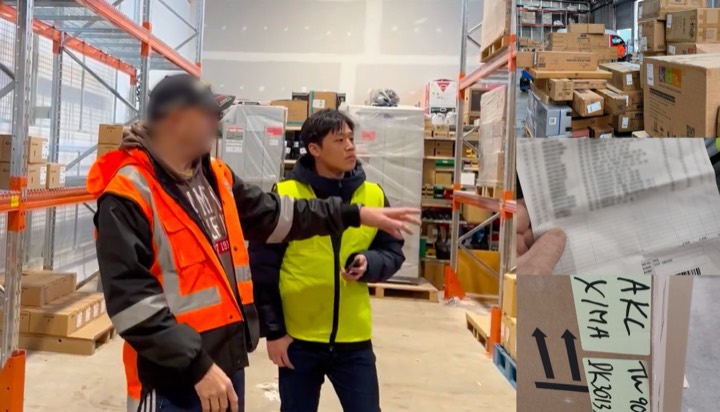
Observe before designing.
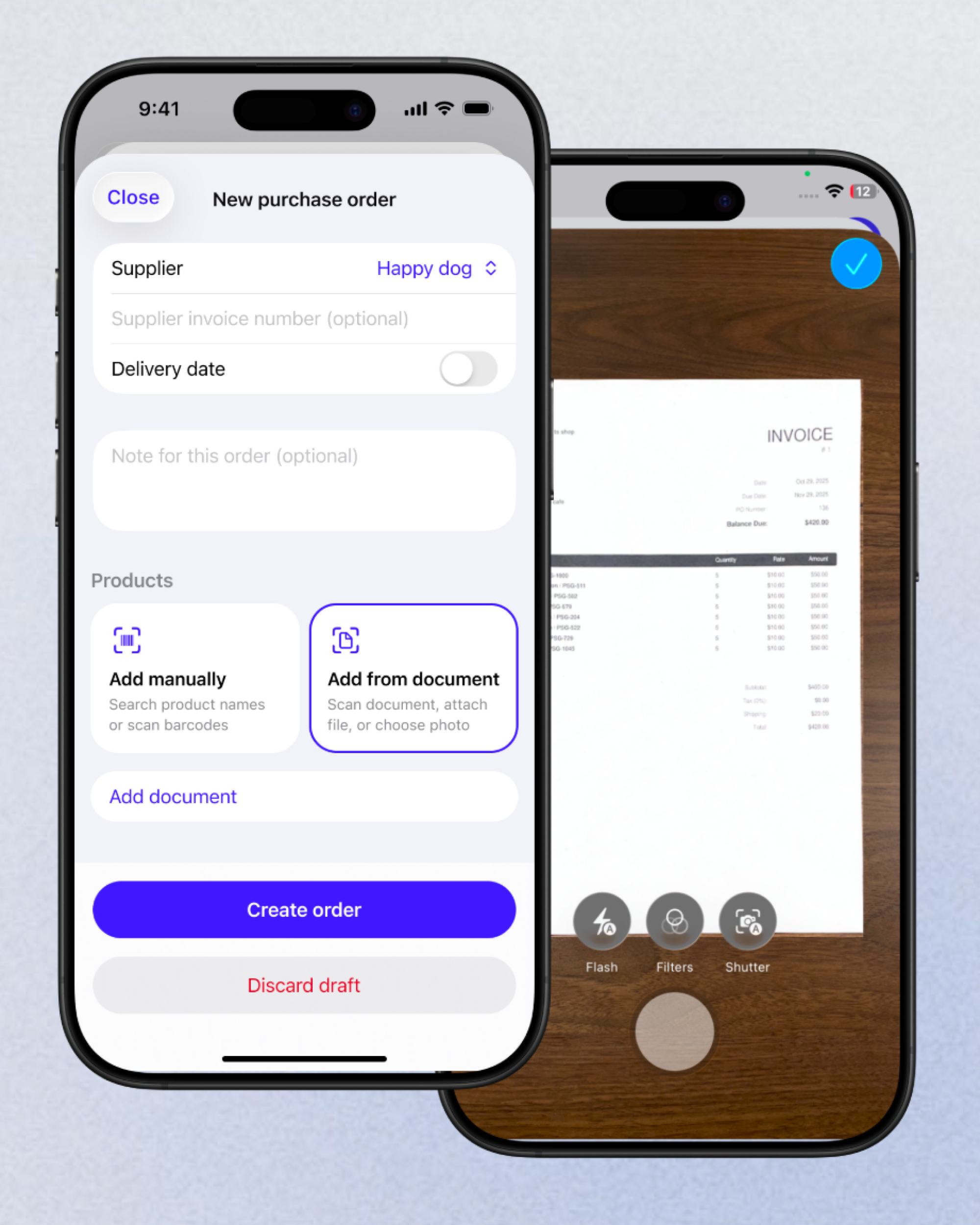
OCR wasn’t the real problem.
Understanding the workflow was.
How the work ran at Afirmo—from finding where people fell out, to learning the tax well enough to lay it out, to checking whether any of it worked.
Afirmo already had capable accounting and tax tools for New Zealand small businesses. People could not tell what the app was telling them, or what to do next.
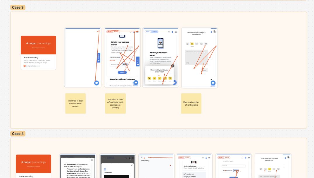
Nearly half of the people who began onboarding never finished it.
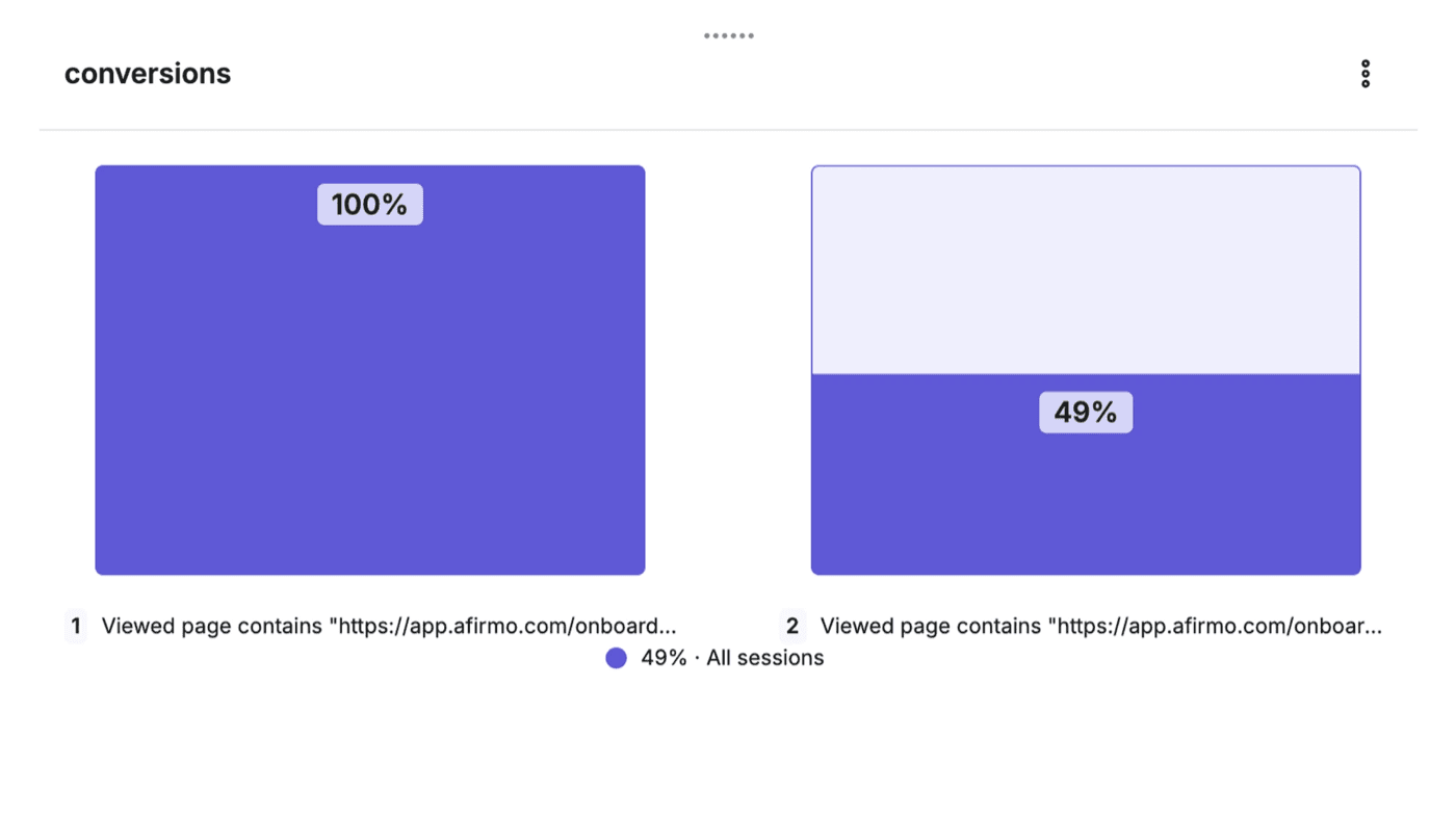
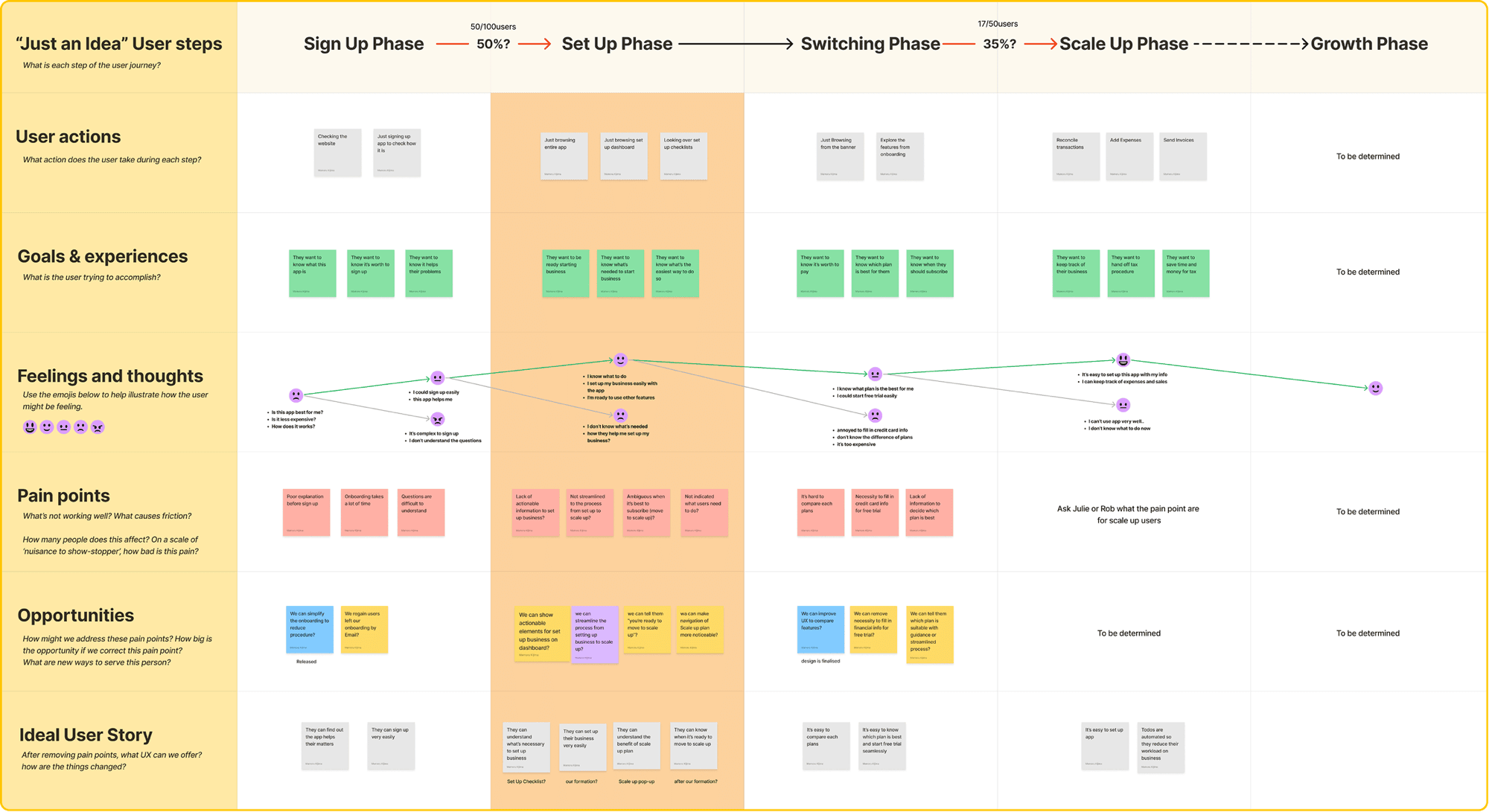
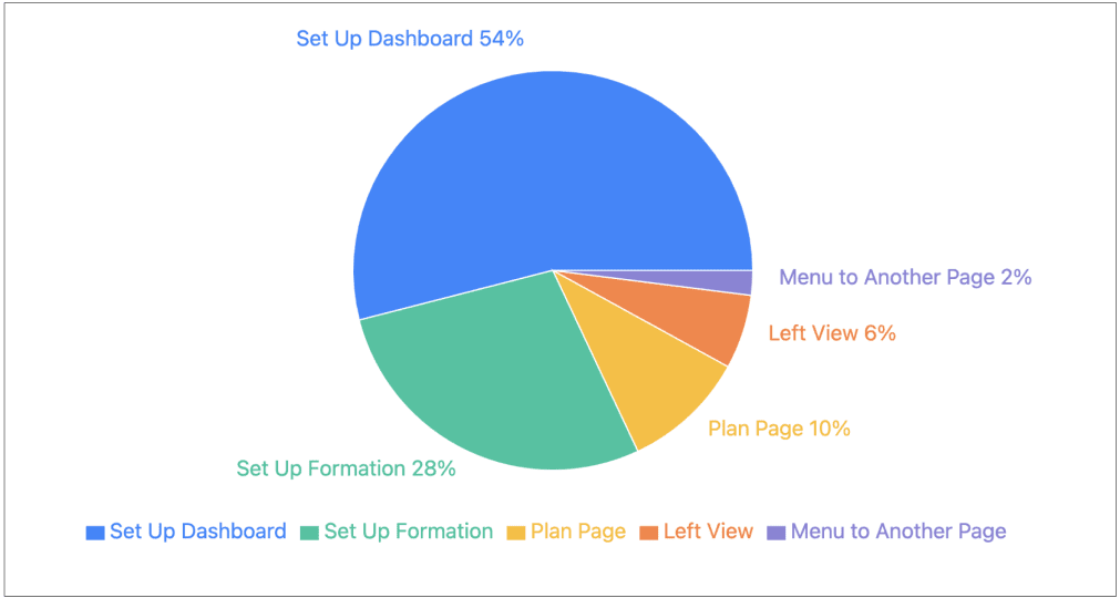
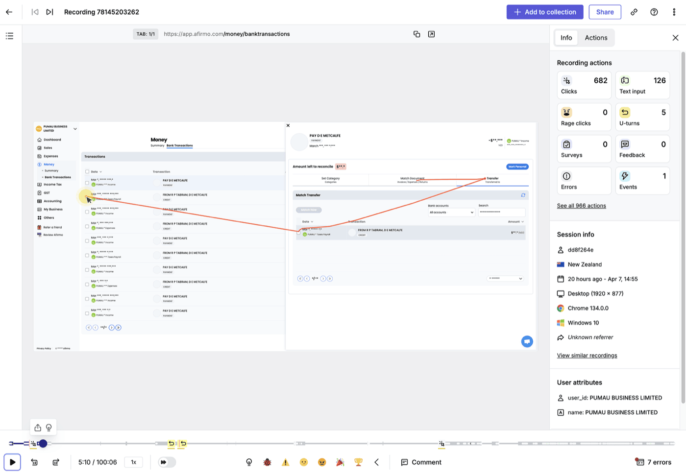
I started by getting the team to one shared picture of the existing issues, then went to behavioural data rather than opinion.
Mapping that onto the customer journey turned a vague sense of “onboarding is bad” into specific phases worth fixing.
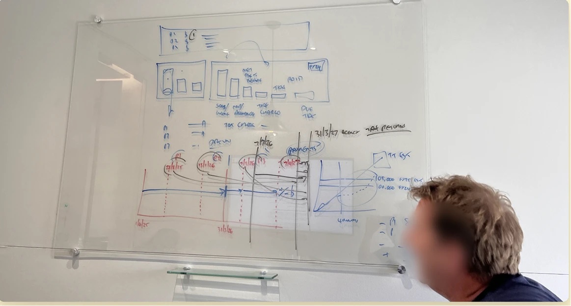
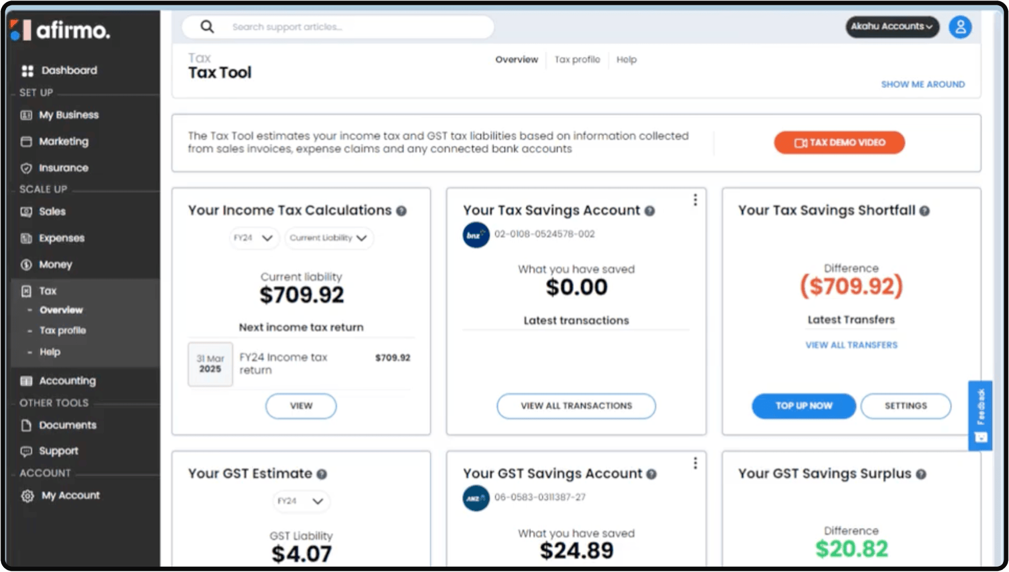
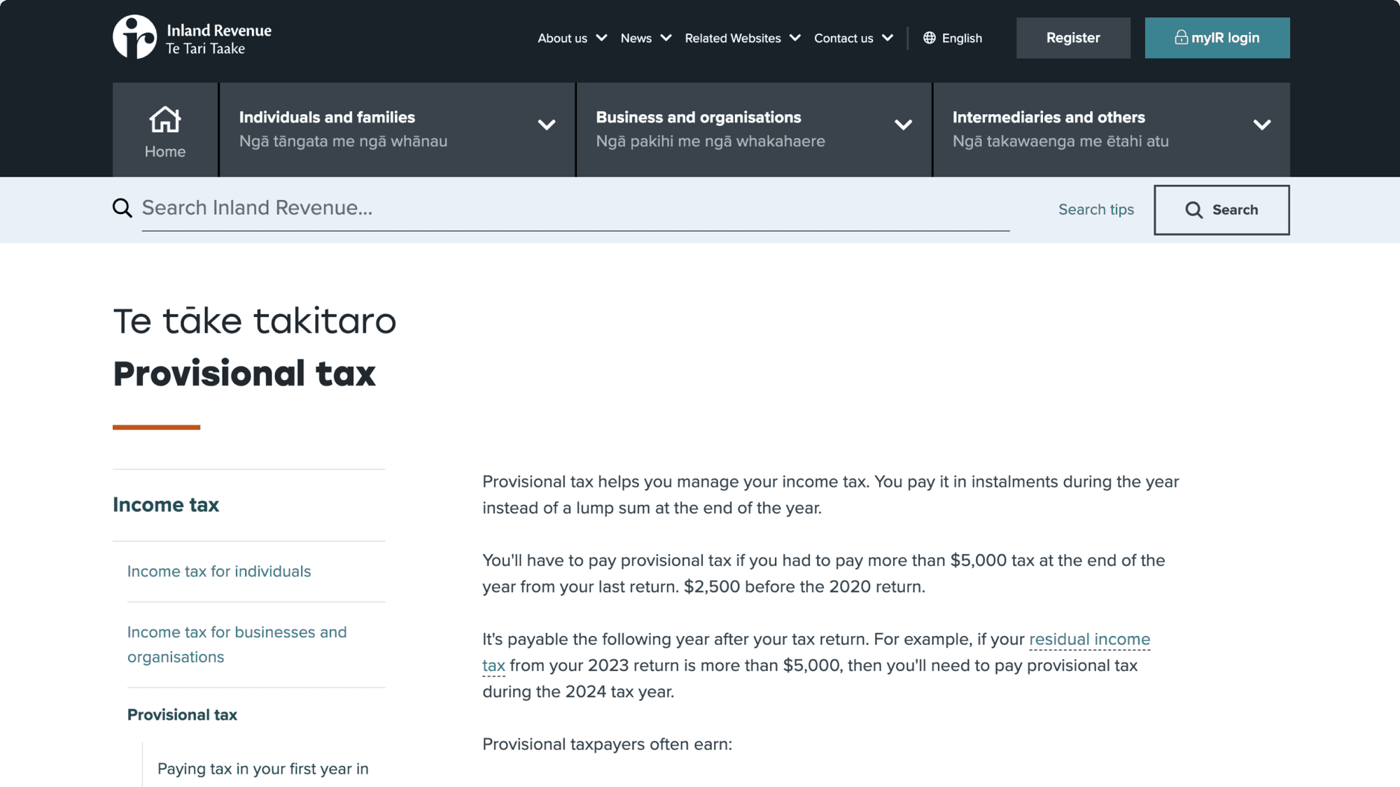
Provisional and terminal tax do not work the way a single “amount owing” implies. I worked through the Inland Revenue material, checked it with the accountants in-house, then mapped the flows it had to carry.
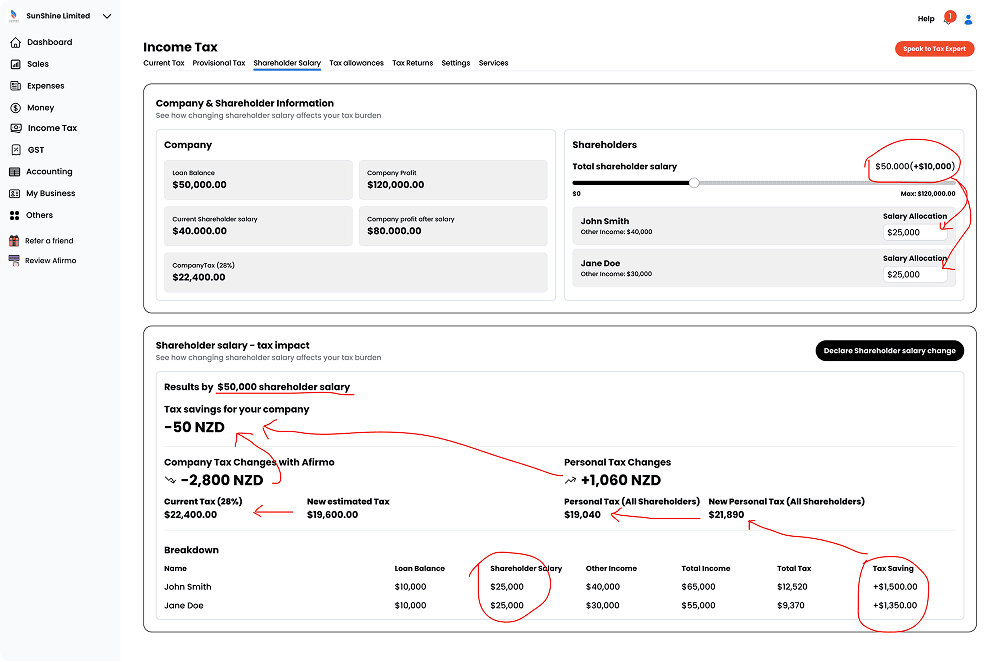
Lo-fi prototypes went in front of the team early, so feasibility came up while it was still cheap to change.
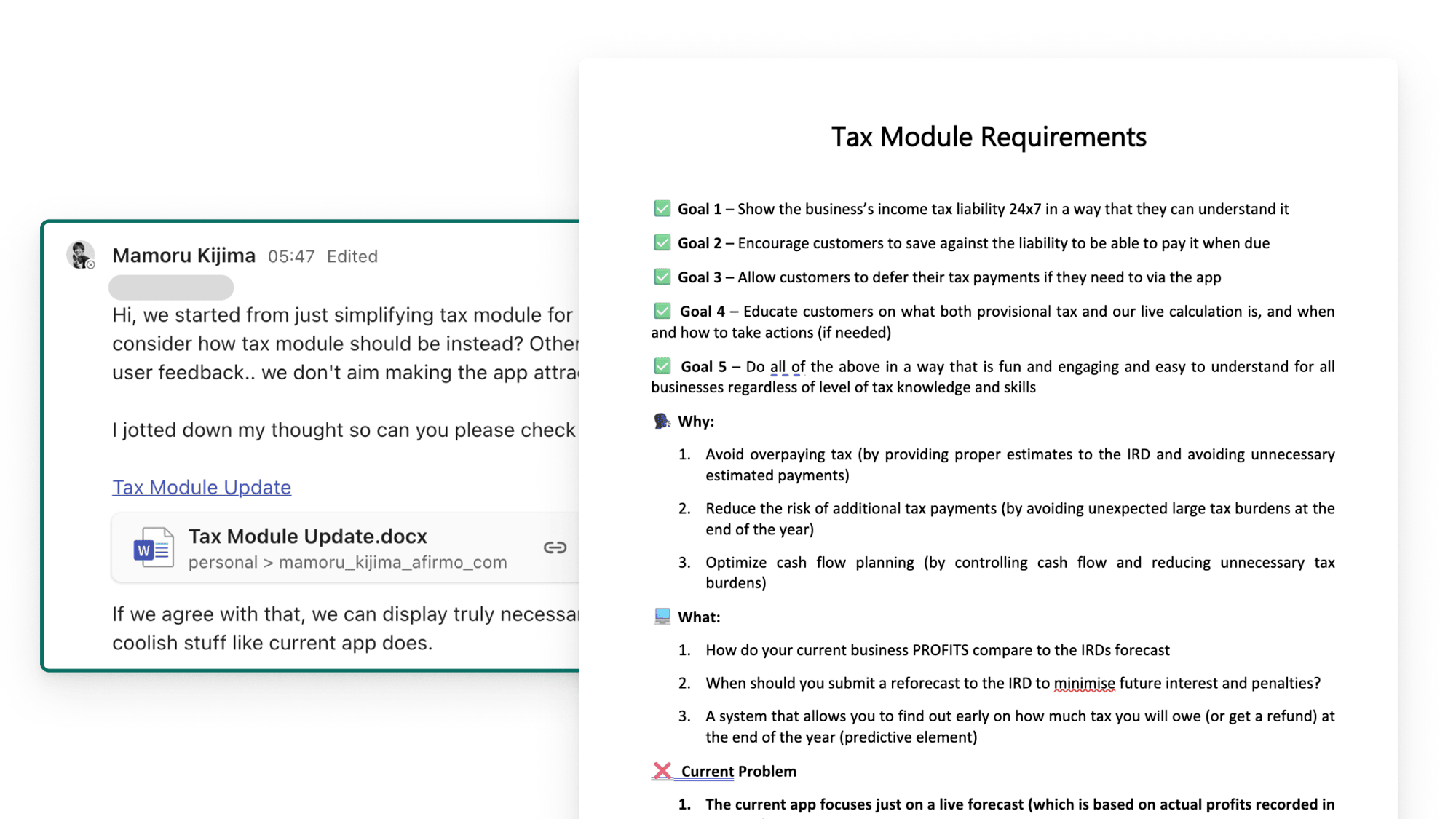
Partway through, the Product Owner and I turned out to be solving different problems—the brief had drifted to simplifying layouts. I wrote the disagreement down instead of escalating it, and it became the team's requirements.
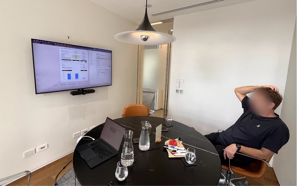
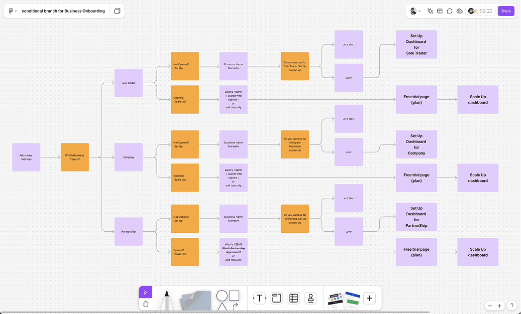
Designs went to engineering as tickets and specifications, not files alone. For the parts with the most branching I drew the flows out, so the conditions were readable without me in the room.
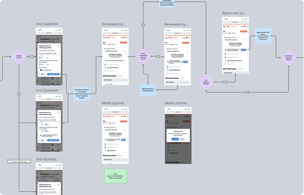
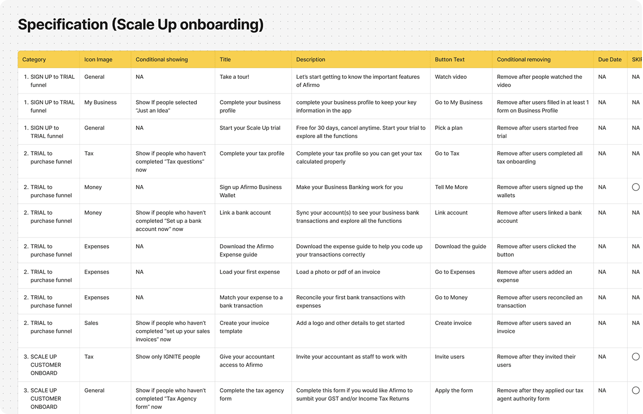
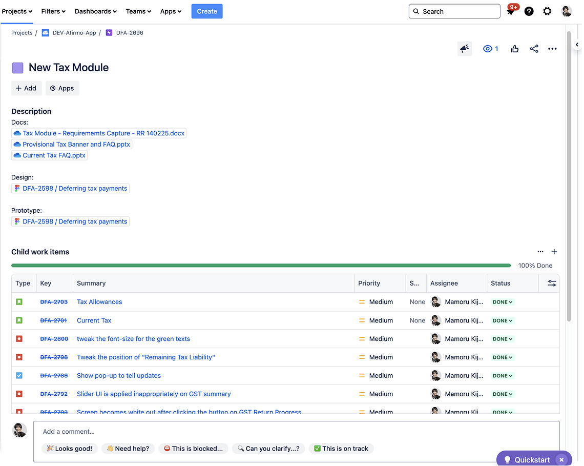
Usability testing ran before development. After release I went back to the analytics and wrote up what had worked and what had not.
Two things did not hold up. Separating company formation from ongoing tax was tidy to describe and costly to use: people lost track of which side they were on, and crossed too often.
The other was the first screen after sign-up. A long list of things to do reads as work, not a start, and people left rather than pick one.
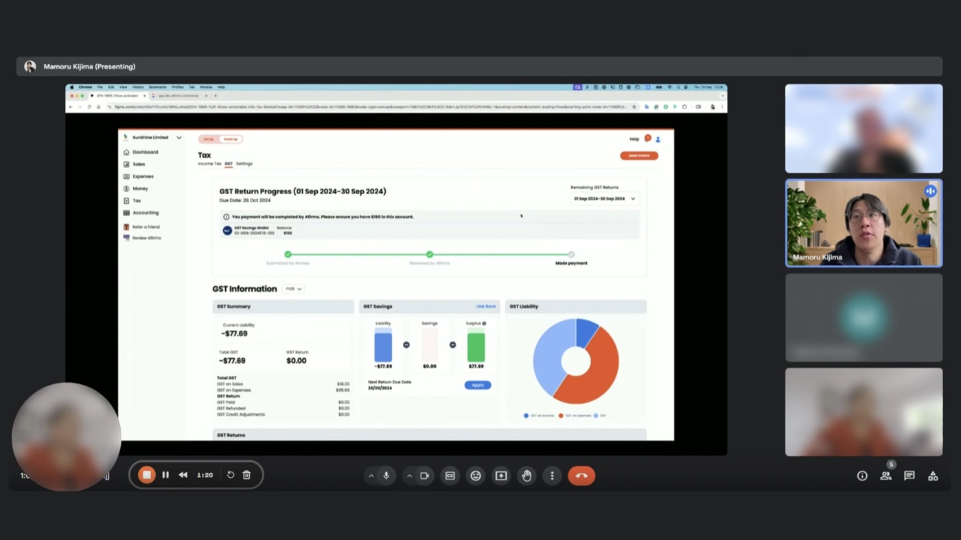
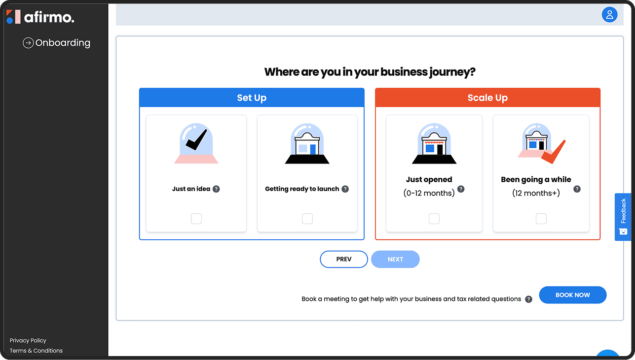
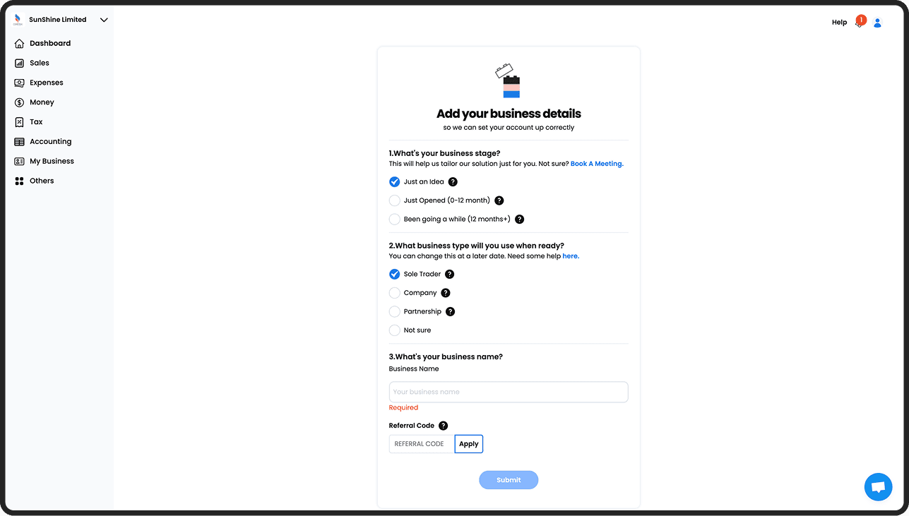
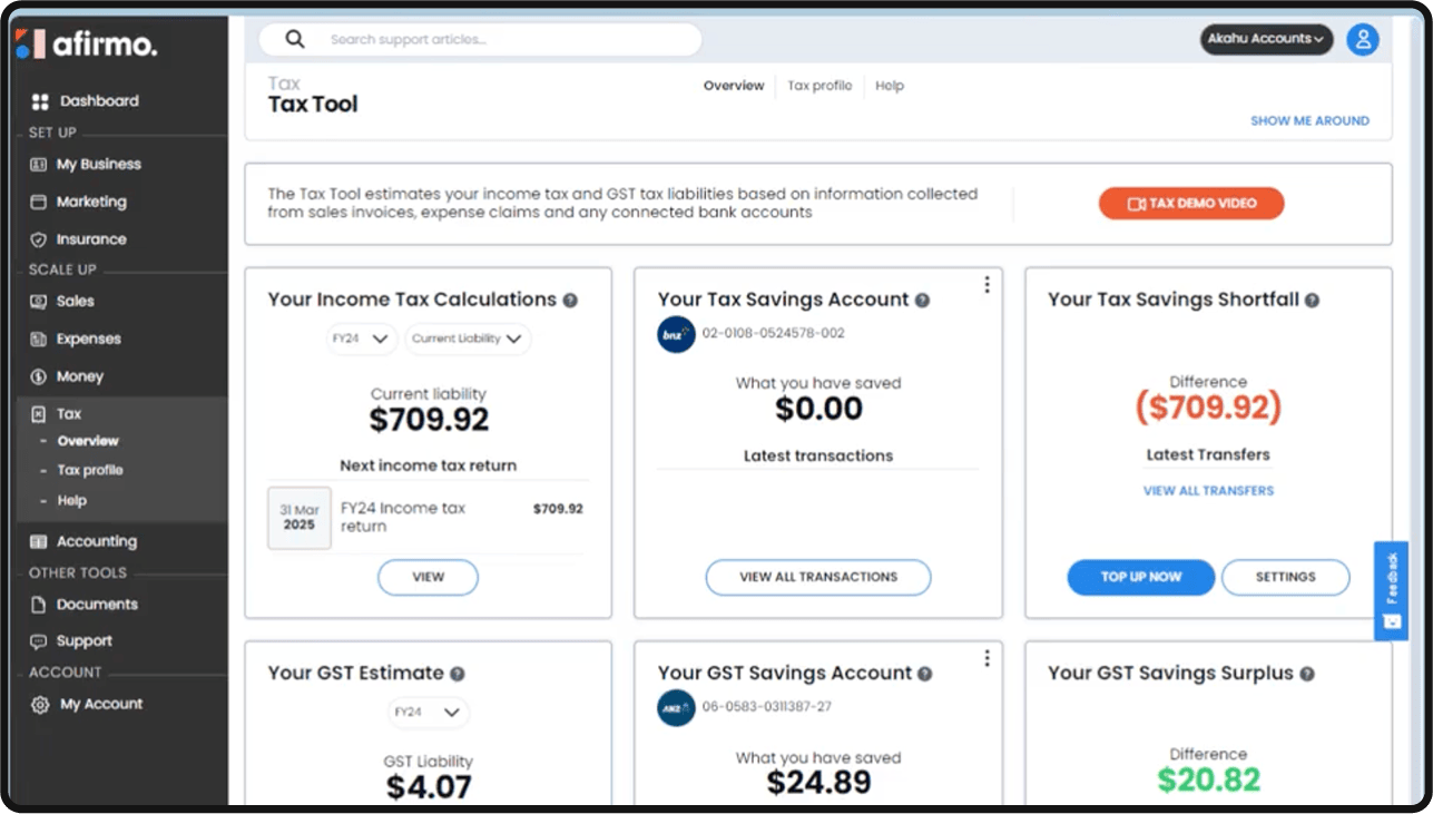
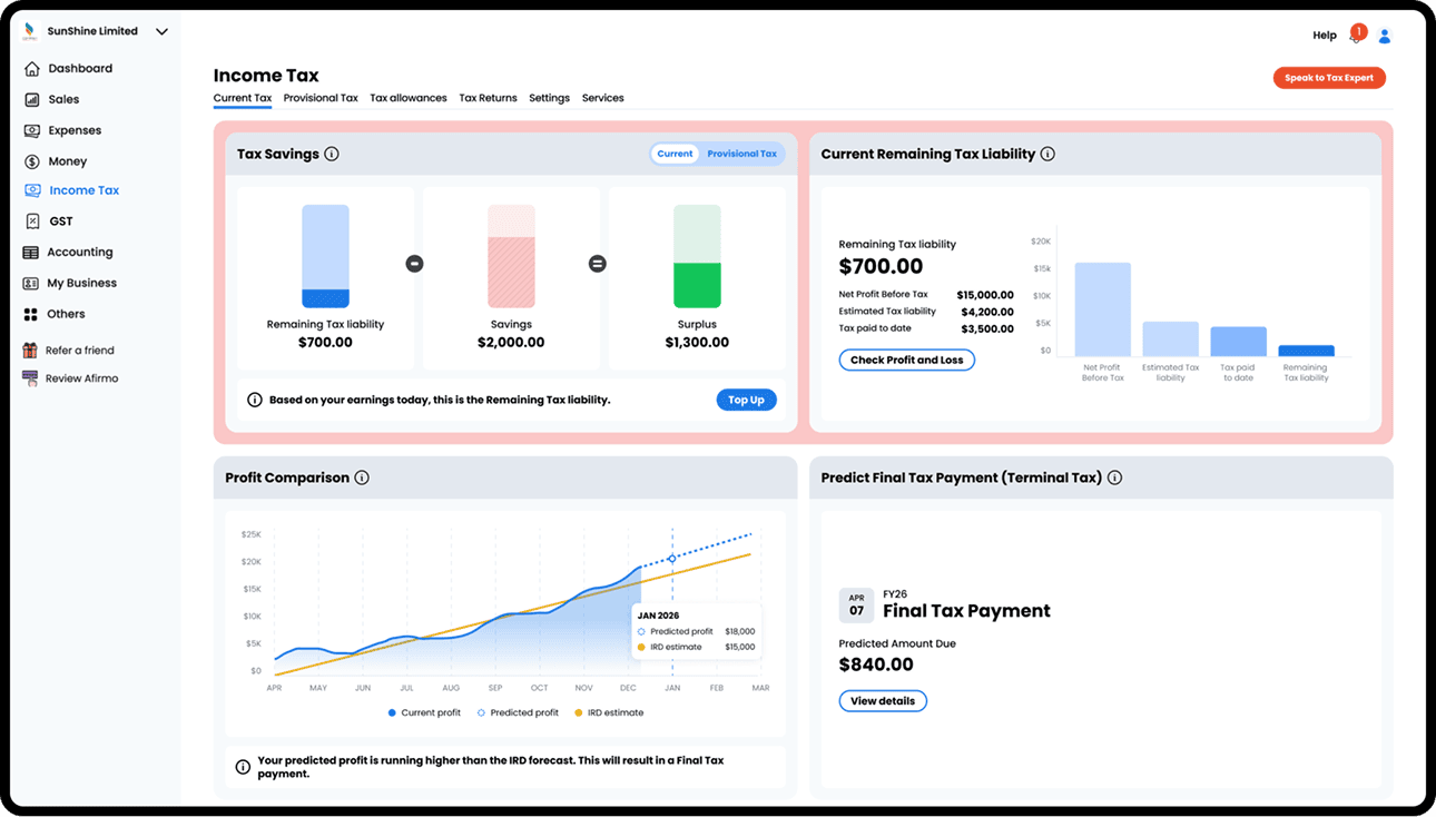
Onboarding collapsed into a single view, the dashboard started telling people what to do next, and the tax view was rebuilt around the question a business owner is actually asking.
All questions on a single screen, with the transitions between them removed.
Liability, savings and surplus shown as one comparison, with a line saying what the number actually means.
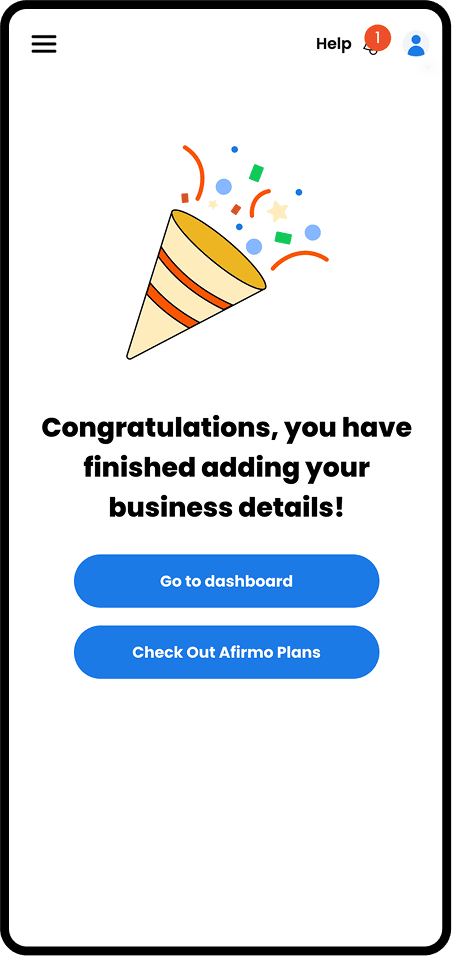
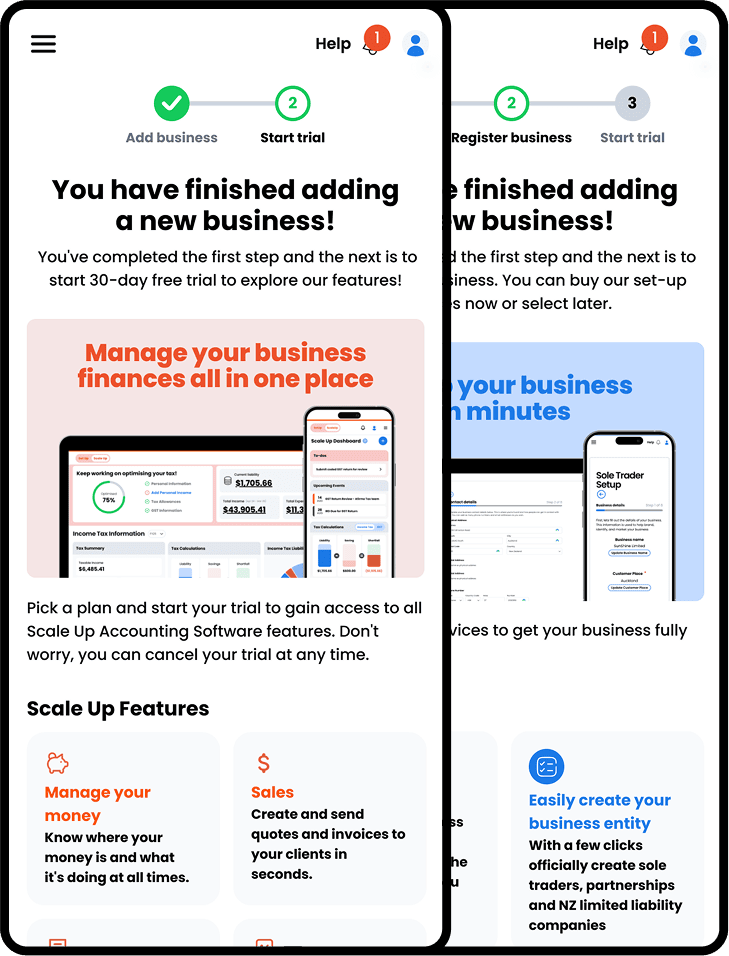
What to do after onboarding depends on the kind of business, so the view adapts instead of congratulating everyone identically.
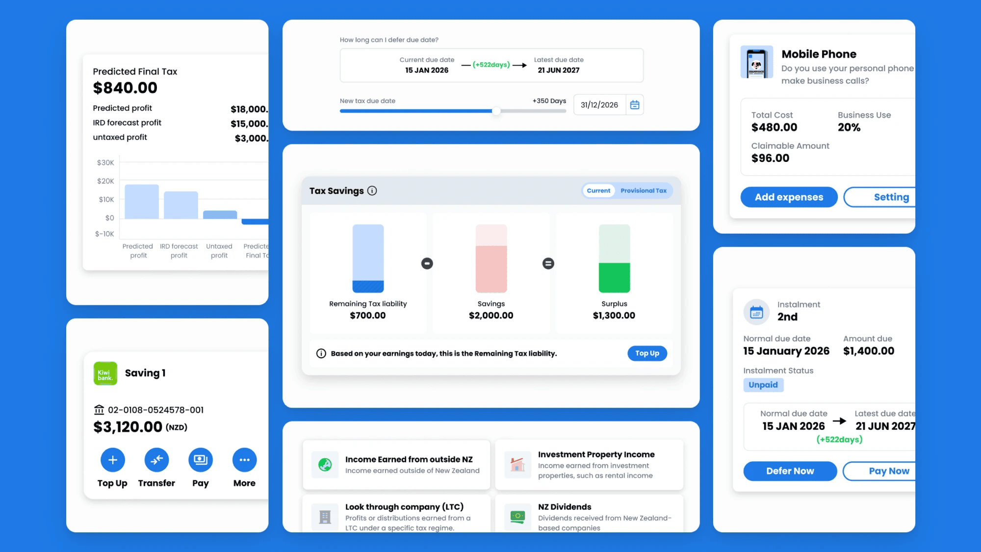
Shipping was the middle of the work, not the end of it.
OCR wasn’t the real problem.
Understanding the workflow was.
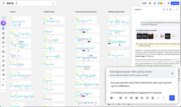
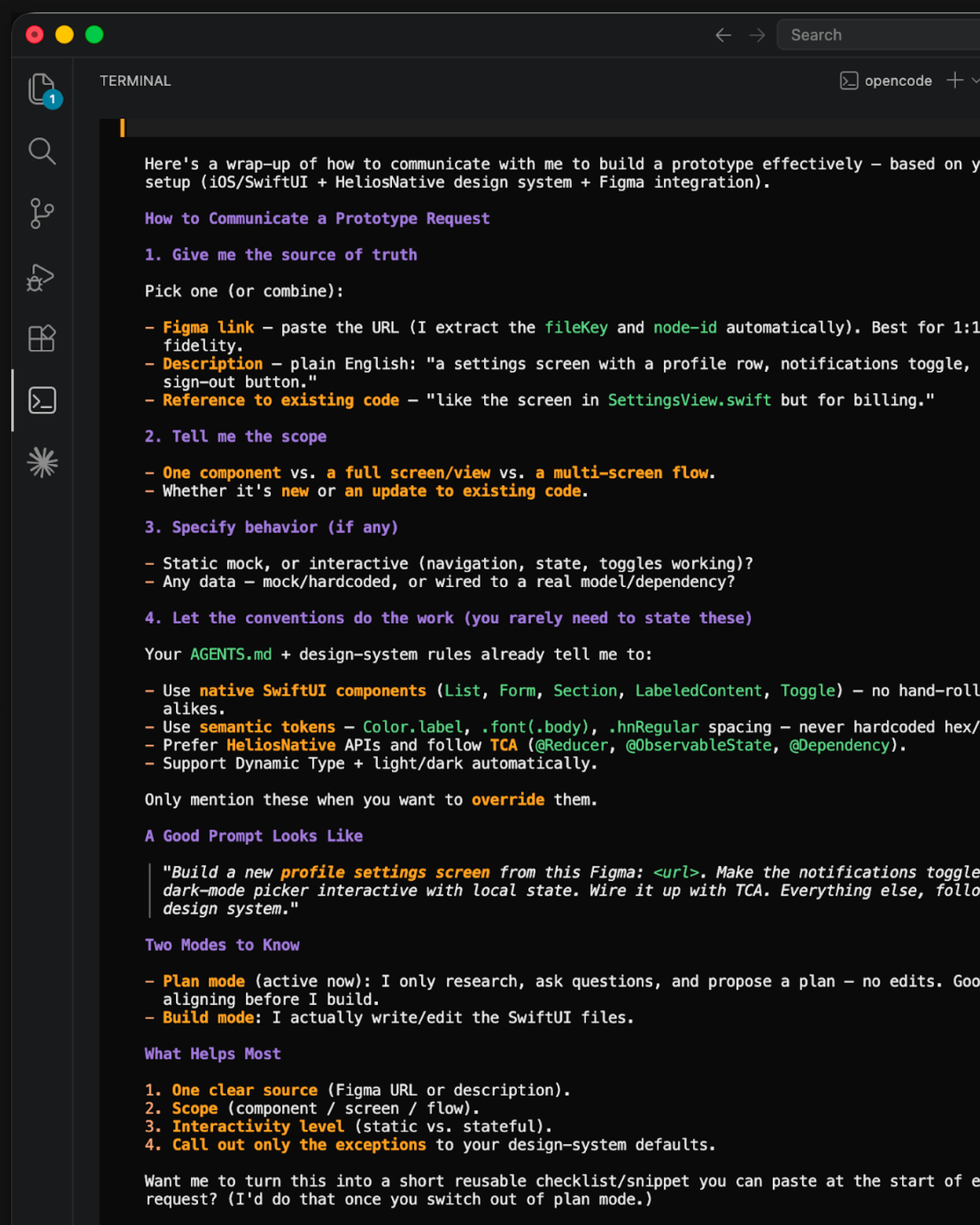
AI helps me explore, challenge assumptions, and validate earlier.
See how I use AI →